182
Vs
Visual communication
Visual communication
When your message is supported by strong visuals that can make the information more appealing and easier to digest. Visualising data can help you spot patterns and make it more easily interpreted.
David McCandless turns complex data sets (like worldwide military spending, media buzz, Facebook status updates) into beautiful, simple diagrams that tease out unseen patterns and connections. Good design, he suggests, is the best way to navigate information glut — and it may just change the way we see the world.
Credit: David McCandless: The beauty of data visualization
Share the love


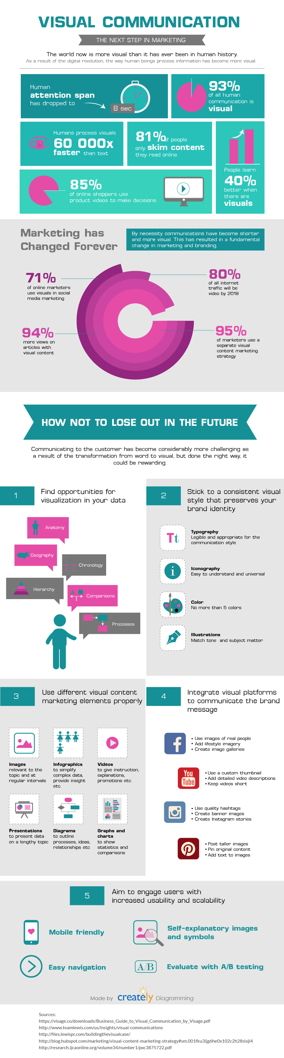
Credit: Creatly: Visual communication the next step in marketing
Share the love
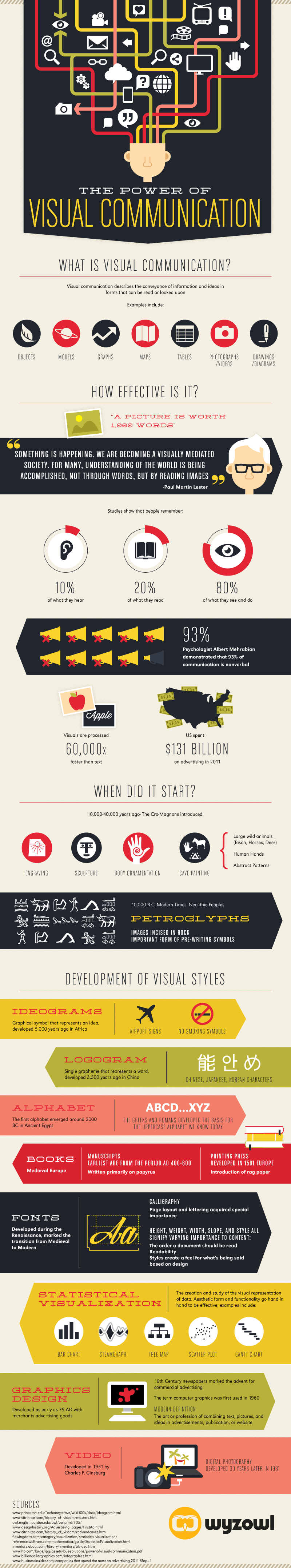
Credit: Wyzowl: The Power of Visual Communication Infographic
Share the love
Share your story with vibrant visual content
When it comes to communication, visual content is a winner.
But why? Where do you start and how can you make the most of the content you create?
Our brains are hardwired to process visual information. In fact, we take in images a whopping 60,000 times faster than text.
That’s a cracking opportunity to make an incredible impact on our stakeholders.
We’ve put together this animation to talk you through it all, explaining why we’re so drawn to visual content and guiding you through the best way to make visual content work for you and your people…
Credit: Share your story with vibrant visual content
Share the love
Thanks for stopping by!
Discovered, created or written something great that links to this element? Share links, articles, videos podcasts or infographics here.
Fill in your details and tick which resource you'd like to share.


